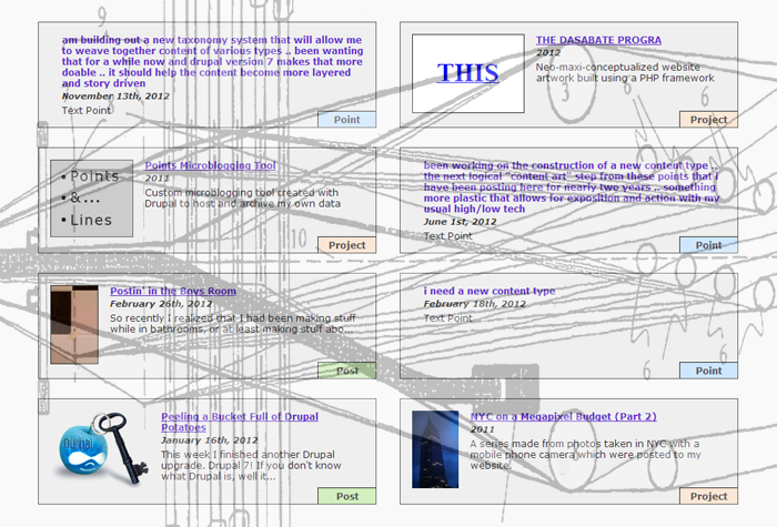
These posts are short blog articles written about me, my friends, and my interests.
You can also try the frequent posts over here in my custom microblogging experiment.
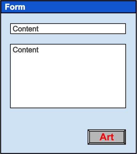
In early 2013 I made this graphic using Google Docs drawing tools. I feel it is already buried deep within my site so I wanted to conjure it back to the fore. I called the drawing Art = Form + Content. It succinctly depicts my primary mode of art making, and is of course also a play on the somewhat dusty yin/yang aspects of modern art: form and content. We have a web form, which could be a customized form or default provided one. We enter some sort of human-content-action into the form, then we click the "Art" save button to complete the content art creation process.
That about sums it up. The resulting web content could be visually customized, but it doesn't need to be. It could be categorized, tagged, listed, etc, but it doesn't need to be. It could be considered "Art" but it doesn't need to be. It only needs to live on the web. This is your act, your creation. It probably has a title or id, and a date. It happened. It lives. And hopefully its existence on the web is a positive one, or at least neutral. If not then you'll just have to try clicking the Art button again.
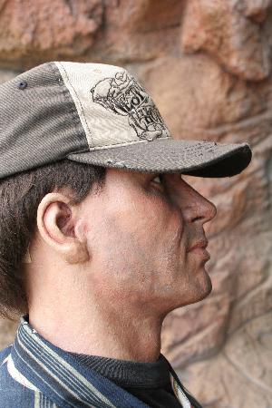
Been a little quiet around here lately. My time has been split up between making new music with the band Narco States, working on a fairly intense Drupal website project (the day job), and traveling whenever possible. Here is something fun from a recent trip to Tennessee. Since I claim to be so busy, I will just copy/paste the comment I posted at the bottom of my latest point page. Click either of the above images or click here to see what I am talking about! ...
Earthquake The Ride and Jurassic Jungle Boat Ride are in the Gatlinburg / Pigeon Forge Tennesse area and both are owned by the same company. As you can see they employ mannequins to simulate audience interest in their amusement offerings, duping passerby in a very competitive area. Growing up in Florida, I am interested in weird, shameless tourism tactics. And this is surely a first! Never have I seen such brash capitalistic awesomeness. We asked a bartender at an adjacent TGI Fridays restaurant, who told us a few years ago this company had terribly lagging sales so in desperation they tried adding these customer decoys and they worked! I believe the Earthquake ride was first and then Jungle Ride came second. From what we could tell no other companies had yet copied their tactic. But they soon will... believe me when I say this is the future of tourism. This sort of thing is actually commonplace on the Internet, but it's spilling over into real life.
Some of the photos were shot by me and my family, while others were found on the Internet. Based on some of the older photos I found, it appears that on the Jurassic Jungle Ride they later changed the attire of some of the decoys to make them look more theme-oriented. This was probably due to backlash at customers realizing they were fooled. I suppose adding a safari outfit and hat does the trick rather nicely, blurring the boundaries of manipulation and amusement.
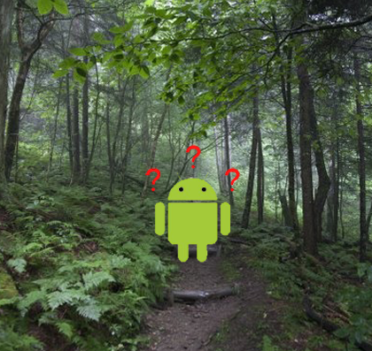
If the meanderings of my work hasn't confused you enough yet, then here is something different. In a recent project I assembled and released the very first free open source topographic maps of the entire 2000+ mile Appalachian Trail (AT). Every Winter tens of thousands of folks (maybe even hundreds of thousands) are preparing/desiring some sort of AT thru-hike or section hike. (I myself am addicted to 100-200 mile section hike trips) In my mind the Appalachian Trial is one of the best things this f***ed up country has. And the more time we as a society spend on computers and networks, the more relevant and important backcountry experiences become. But I'll step off the soapbox because most of you probably wouldn't want to spend weeks or months all dirty and sweaty, constantly hungry and achy in a beautiful "green tunnel" with the bugs and snakes.
Sorry but de-romanticized statements like that are for your own safety. And so are my free Android maps. Two years ago I posted instructions here at the WhiteBlaze.net forums on how to make your own free smartphone backpacking maps. The post has received nearly 10,000 hits, but unfortunately those instructions no longer work. All the topographic map sources which were once freely available to Mobile Atlas Creator (MOBAC) have been yanked. Mapping services have matured to a point where the free ride is over as data pushers pay attention to the dollar signs. Luckily I found an alternative map tile source... OpenStreetMap (OSM) to the rescue! An amazing organization. However they too have bills to pay and don't allow map tile downloads via map making software such as MOBAC due to server/bandwidth costs. (Keep in mind that maps *must* be fully downloaded in advance of your backcountry trip and used offline due to network and battery constraints) Luckily I found an alternative OSM tile hosting source... Stamen Design to the rescue! This heavy-duty, San Francisco based visualization agency hosts OSM tiles, and they generously gave me permission to use their server to assemble and release these Appalachian Trail maps.
Traditionally an AT thru-hiker would spend $100-$200 on paper maps. So many maps are too heavy to carry all at once, and must be strategically snail-mailed to various post offices along the trail. Many of those paper maps, in my opinion, look so "1990's desktop PC". (not that there's anything wrong with that aesthetic!) Nowadays you can also purchase an iPhone or Android app that has topo offline maps of the trail. Costs for those are typically $30-$60, which compared to paper seems fair, but then again is it? Not in my mind, and I didn't spend a bunch of money testing them because I found OruxMaps. This Android app is free (donations welcomed) and is of great quality. I have field-tested OruxMaps for hundreds of mountain trail miles without a single crash or issue. So I chose the OruxMaps format when I compiled the maps.
Something I learned this time around is that OruxMaps is a "dead end" data format - one cannot convert maps from OruxMaps to a different format, yet one *can* easily convert from a more standardized format to OruxMaps plus many others. Perhaps next year I will try to make better maps, in a more open data format so folks can choose their own platform/app. Though I am a software professional with thousands of trail miles under my feet, I am just a map-making amateur. I am learning as I go along, step by step, just like when I am hiking. (oooh that was cheesy) I hope more folks start creating and sharing open source offline maps, as I see them as an integral part of taking breaks and finding adventure off the grid. Sounds weird but yes I am advocating the use of the Internet to help us get away from the Internet!

Hey if you happen to live in the Twin Cities of Minnesota then please let me invite you to a show this Friday Jan 24 at the Nomad World Pub. Details in the flyer poster thing here that our singer Mike made. We (Narco States) are going on at 11 or 11:30pm. I play drums. Canopus Drums! I recorded a vinyl EP record with the band and this is the show to support that effort. To get an idea of it we got a nice writeup on the record recently here. More about the Narco States debut EP coming soon. I recently added a project page for the band website which I built. Should be fun. Live Acid Rock... this is what I secretly live for.
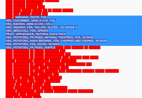
Spun up another Thread called Ragged Lists. I have been wanting to assemble these works together for a while now, most were made in 2007-2008 when I was monkeying around with the aesthetics of ragged typographic layouts. This is something I feel we often take for granted. Every day we see, use, or make such lists, which in the western world are typically flush left aka left aligned aka ragged right. Because the elements of the list are of varying length, a rhythm occurs along the ragged edge that is based on the underlying data of the list. The rhythms could be very random, have gradual fluctuations, jumpy, etc. Most of these particular ragged lists are made of weird datas that I like... found text, spam, random dictionary data, or hastily written poems. The longer lists are software generated HTML and CSS, while the shorter ones are handmade. Some of the longer lists become "interactive" when you scroll up or down, an action which tends to accentuate the rhythm of the ragged edge.
If it is the artist's job to find beauty in simple things then here you go. What could be more simple and beautiful than information, existing in a list, with its very own rhythm. It is also the artist's job to communicate this perceived beauty to others, and these ragged lists may or may not be all that successful there, since that wasn't necessarily the goal when making them. They were created while I was going in many directions at once, which is often the case with me, and also the reason I named these collections Threads, not Bricks.
I have been building out a new website feature here I am calling Threads. So far I have made just one Thread entitled content art. For a year or two I have been tossing around these words content art to describe my creative practice, which is crafting, posting, and organizing web content. I have hesitated to give content art a more formal definition, and so until further notice I now declare this new content art thread to be the definition of content art. As you'll see, even this post is included there. Its all additive. I have thousands of chunks of content data here at stevenread.com, defined and structured in various ways, but the content needs more cohesion. The main goal of Threads is to weave together content of any type into one idea at one place. After seven years of adding content to this site, until now I have not had an easy way to associate content of different types... Projects, Posts, Points (and sometimes Pages).
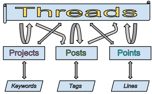
Each of these content types were designed to have their own taxonomy system (Keywords, Tags, and Lines). As you can see from the diagram above, Threads is a taxonomy for any and all of them. Seems like content management systems such as Wordpress or Drupal should be more focused on content type interplay, but they are not (unless you customize the crap out of them). Almost any site you go to, organizes and displays content only by a singular type. They'll show you a listing of blog articles. An album of photos. An group of status updates. A collection of pages. But that is not reality. Reality is never conveniently segregated like that. Expression comes at different times in different forms. I want more fluid, expressive content, that is loosely decoupled, and active. I want a list of any thing at any time from any place to support any idea. But now I am getting ahead of myself. I have lots more work todo, this is just a baby step. More Thread content and new functionality will come, I just need to dig into the content and spin up new Threads. I have two modes of work: making tools and using tools. Time to be the user!


A few months ago I was very happy to learn that a website which I worked on and launched as lead engineer won a 2012 Webby Award for Best Community Website! Cancer is something of a dirty word, and the website takes that bull by the horns, providing a new experience for those who may feel victimized and helpless. While not the only honor/award given to the I Had Cancer project, I see this as "kind of a big deal" for everyone involved, especially considering the competing sites in this category included Tumblr and Flickr. Please note this was not my project, I was a hired Lead Drupal Consultant and my involvement is documented at the project page. Software developers rarely get credit for what they do, thanks to a completely unorganized and unregulated software industry, so for now we have to give ourselves the pat on the back. And I recommend more software developers do just that... ain't no shame!
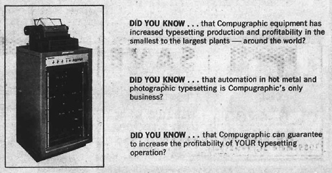
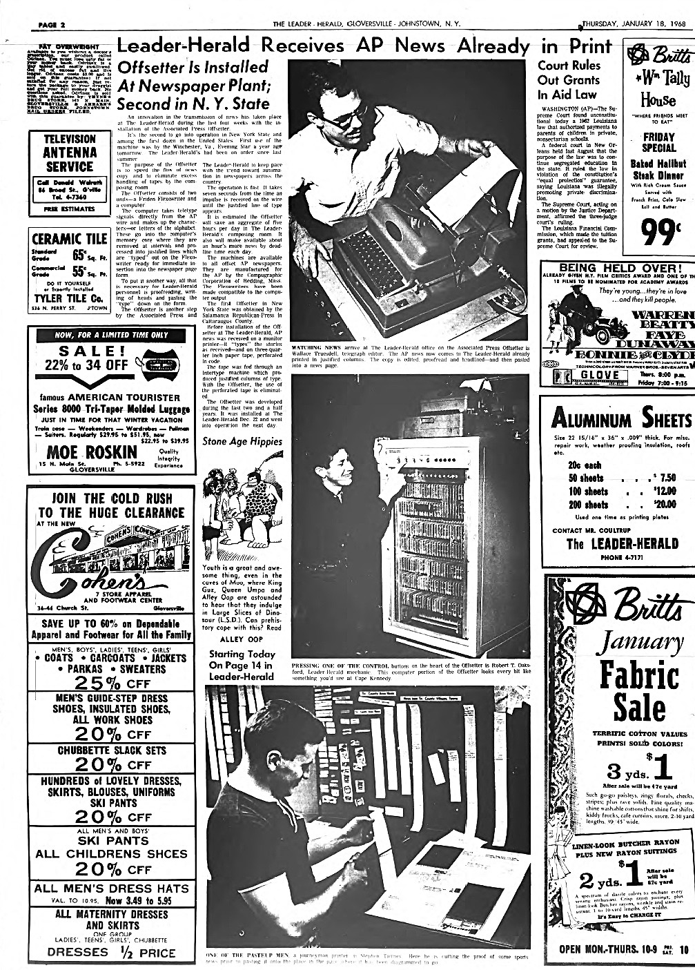
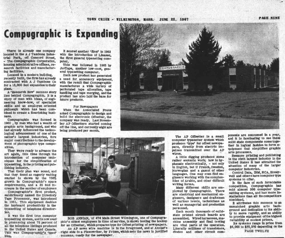
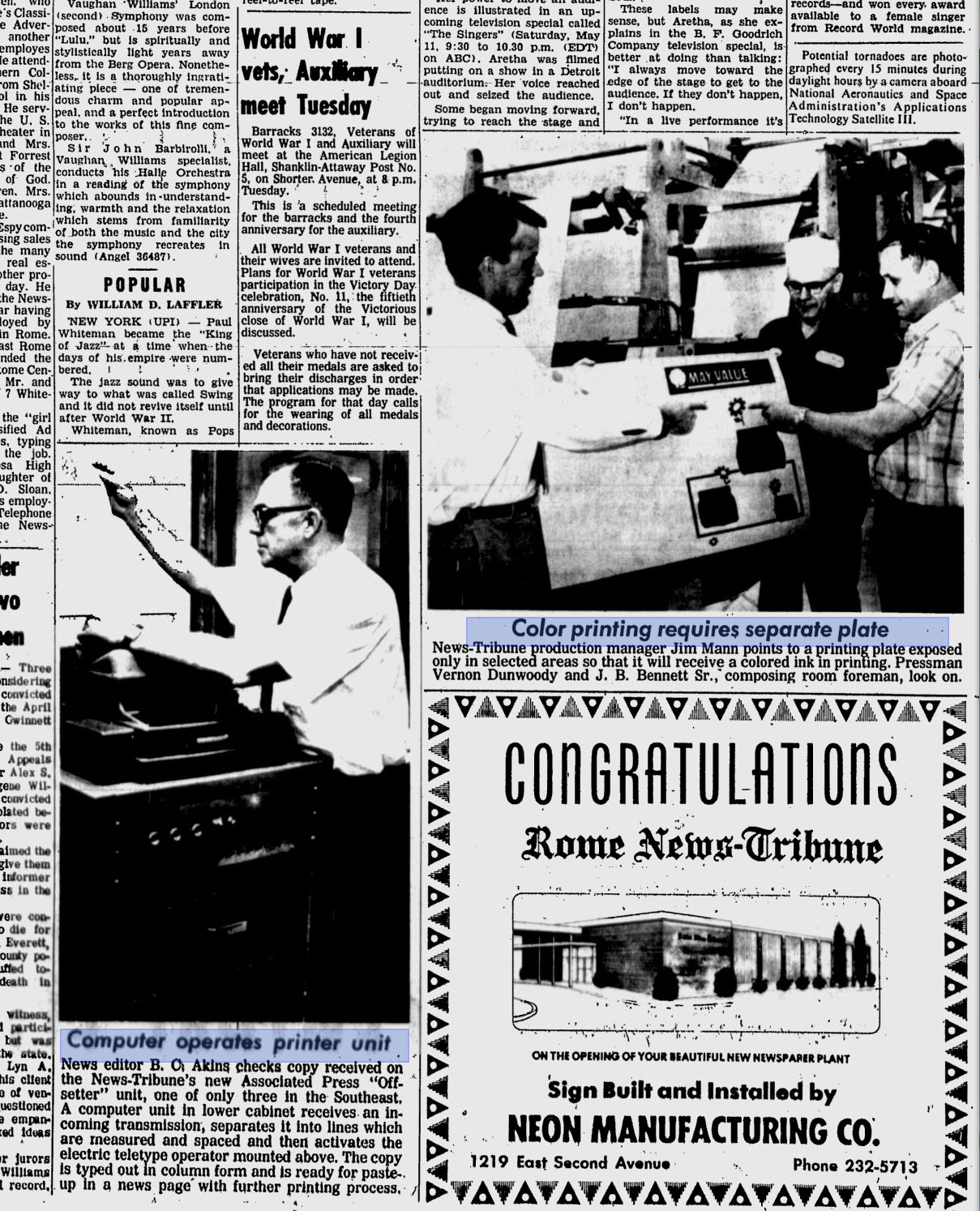
Have not been as active here at stevenread.com as I'd like to be, been on something of a summer break. I've been working on this website for 7 years now and I do suffer the occasional burnout. But I have been active posting content elsewhere at ye ol' ebay.com, where my posts actually put cash in my pocket! I'm a semi-pro-amateur antiques picker who specializes in digital weirdness. At a recent estate sale I found this electronic panel sitting in a junk box under a workbench in a basement. Was intrigued by the "Associated Press" markings on the front so I bought it. Doing some research it turns out to be the control panel of an "Offsetter" from 1966 which "converts wire-service signals directly into camera-ready copy" according to the MonoType Imaging website. Cool! This refrigerator-sized computer sat in newspaper offices processing AP news wires and printed them out formatted and ready for press (or the trash bin). It must have saved thousands of typesetting manhours, but likely at the cost of losing some creative control.
The found control panel has a whopping 3 buttons "prime" "start" and "stop". When consuming news media what else do you really need? Only a few thousand of these units were made by Compugraphic, a company based in Wilmington, Mass. I assume not many folks have heard of these. I never had. But it seems like an important, pre-internet computer, as networked article feeds are practically the fuel of today's Internet. I am determined to find a good home for the rare vintage Offsetter panel and so if you know of someone who might want this it is currently for sale on eBay. During my research I found some great newspaper articles from the 1960's showing the device in action. Here are some of those:

So recently I realized that I had been making stuff while in bathrooms, or at least making stuff about bathrooms. A little Toilet Art never hurt anybody, and if it does then who gives a poop shoot. I did not plan in any way shape or form on dealing with toilet culture, as this new men's room media occurred spontaneously, naturally, refreshingly; like a pine scented, dew covered, alpine spring morning. This organic drupal dumping of content is my latest strategy of strategies, the tactical idea of which is to make stuff daily as it comes, in small easy to digest chunks, without thinking too much in advance about where when or why, just blowing. A reduction of intellectual contrivance, a wooden handled plunger to the inherently contrived nature of my chosen medium (compoopers). The pudding is in the proof of the poop from pudding! It's not that I necessarily need to demystify technology art by hiding out in the restroom, but that I necessarily doo *want* to. And to investigate how it leaks in and out of everyday life, and to experiment as usual with the least amount of technology required to make decent digital defecations of the brain. So this is not a project, not a process, probably not even an endeavor. **it just happens. Auuhhh time for a courtesy flush...
 The animated GIF I posted above called Lo00oK is one such boy's room post that I like which arose from this photo taken with my mobile smartphone while I was peeing at a pub. Even though it arose from the lowly evacuation of cheap mid-western beers, it seems to open new doors into old landscapes of glitch. But I didn't manipulate this photo while in the public restroom. One morning after bananas, prunes, and coffee, while sitting at my computer laptop machine with nothing better to do I looked on my phone device gadget and found a digital photo graph that I barely remembered snapping a few days prior, and I rotated it and mirrored it a couple times and then altered the brightness/contrast successively with some fancy tweening and lossy manipulation blah blah. Then I posted it here. Shyte, I suppose that basic photoshop work *could* have been performed while standing up at a urinal using a small laptop strapped to my person. But doing that and making a big statement out of it would probably have been so fucking contrived and lame. I always want to counter potential lameness with counter-potential lameness. Smart, right?
Today there exists a handful of other such washroom posts categorized into a "line" of "points" here. (i am toying with the idea of making all the "lines" on the points page bloggy-formatted like that) In that bathroom line you'll smell more animated-photo-gif type things, mini-galleries, thoughts, etc. I could digress here further on some of those hindsightedly-related bathroom points, but that feels overbearing. I wouldn't want to flush away the mystery with my meta-flatulence. After all, since I don't show in physical galleries anymore... THIS IS MY LATEST ART SHOW. So stay tuned for more of this sort of keeping-it-regular type thing. It is destined to happen. Art. Life. Content. "Mierda!"

